Data Visualization with Python: Mastering Matplotlib
Hello HaWkers, it's not news to anyone that in the current scenario of increasing generation and consumption of data, the ability to visualize and interpret this data becomes a differentiator.
Python, one of the most popular and loved languages in the world, offers us the Matplotlib library, a very complete tool for creating clear and impactful graphical representations.

Why is Data Visualization Important?
Visualizing data isn't just about creating pretty charts. It's about telling a story, identifying trends and patterns, and facilitating informed decision-making. Effective visualization enables businesses and individuals to better understand their information and helps communicate insights more effectively.
Getting to know Matplotlib
Matplotlib is a Python 2D plotting library that produces quality figures in a variety of formats and interactive environments. From histograms, scatter plots to pie charts, Matplotlib offers a wide range of tools to create powerful visualizations.
Getting Started with Matplotlib
Installation is simple, just a pip install matplotlib. With the library installed, creating a basic graph is intuitive:
import matplotlib.pyplot as plt

fig, ax = plt.subplots()

fruits = ['apple', 'blueberry', 'cherry', 'orange']
counts = [40, 100, 30, 55]
bar_labels = ['red', 'blue', '_red', 'orange']
bar_colors = ['tab:red', 'tab:blue', 'tab:red', 'tab:orange']

ax.bar(fruits, counts, label=bar_labels, color=bar_colors)

ax.set_ylabel('fruit supply')
ax.set_title('Fruit supply by kind and color')
ax.legend(title='Fruit color')

plt.show()
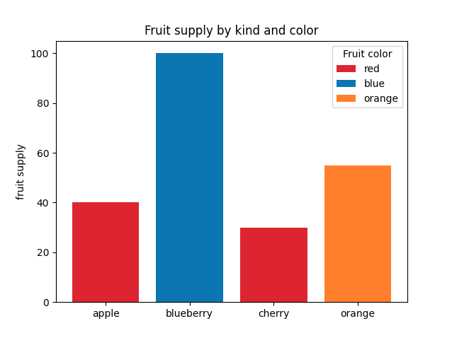
This code creates a bar chart that shows the supply of different fruits (apple, blueberry, cherry and orange) along with their respective colors (red for apple and cherry, blue for blueberry and orange for orange).
The y-axis indicates the supply of fruits, while the x-axis lists the types of fruits. The graph legend highlights the color associated with each fruit. At the end, the graph is displayed in the output window.

Advancing the View
With Matplotlib you can customize almost every aspect of your plot:
- Colors and Styles: Change colors, add captions and adjust line styles.
- Titles and Labels: Improve readability with clear titles and informative labels.
- Subplots: Create complex layouts with multiple subplots.
Personalization and Interactivity with Matplotlib
Matplotlib also offers functionality that allows you to create interactive graphs. With these options, you can add buttons, scrollbars and other interactive elements that make the user experience even more engaging. Furthermore, it is possible to integrate these graphics into web or desktop applications, making the library extremely flexible for different types of projects.
Charts with Categorical Data
Matplotlib is not just about continuous numbers. You can also create visually appealing charts for categorical data.
import matplotlib.pyplot as plt
categories = ['Category A', 'Category B', 'Category C']
values = [50, 30, 20]
plt.bar(categories, values, color=['red', 'green', 'blue'])
plt.title('Data Distribution by Category')
plt.show()This code produces a bar chart with different colors for each category.
Category A, Category B and Category C. Each category has an associated colored bar:
- Red for Category A,
- Green for Category B;
- Blue for Category C.
The graph has a title "Data Distribution by Category" and, at the end, is displayed in the output window.
Creating Pie Charts
Pie charts are excellent for representing proportions and percentages:
import matplotlib.pyplot as plt
labels = 'Frogs', 'Hogs', 'Dogs', 'Logs'
sizes = [15, 30, 45, 10]

explode = (0, 0.1, 0, 0)
# only "explode" the 2nd slice (i.e. 'Hogs')

fig, ax = plt.subplots()
ax.pie(sizes, explode=explode, labels=labels, autopct='%1.1f%%',
        shadow=True, startangle=90)
plt.show()
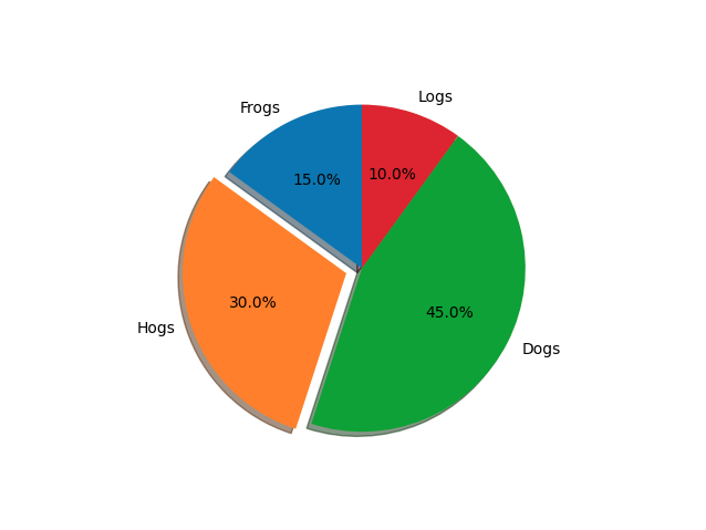
The code uses the matplotlib library to create a pie chart representing the distribution of four categories: Frogs, Hogs, Dogs and Logs. The graph slice sizes are 15%, 30%, 45%, and 10%, respectively.
The particularity of this graph is that the slice corresponding to the 'Hogs' category is "exploded" or highlighted from the center of the graph. Specifically, this slice is moved off-center by 10% of the graph radius.
Additionally, the chart has the following characteristics:
- Autopct: Percentages are shown in each slice of the graph with an accuracy of one decimal place.
- Shadow: The graphic has a shadow effect, giving it a 3D appearance.
- Startangle: The graph starts at a 90 degree angle, which means the 0% slice (the first slice, 'Frogs') starts at the top.
The graph is displayed using the plt.show() function.
And this is the generated graph:

Using Histograms for Frequency Distributions
Histograms are ideal for visualizing frequency distributions. Here's how to create one:
import matplotlib.pyplot as plt

data = [21,22,23,4,5,6,77,8,9,10,31,32,33,34,35,36,37,18,49,50,100]
bins = [0,10,20,30,40,50,60,70,80,90,100]

plt.hist(data, bins, histtype='bar', rwidth=0.8, color='#86bf91')
plt.xlabel('Value Ranges')
plt.ylabel('Frequency')
plt.title('Frequency Histogram')
plt.show()
Animations with Matplotlib
Yes, you can create animations with Matplotlib! Although it's a little more advanced, here's a basic example of a line animation:
import matplotlib.pyplot as plt
import matplotlib.animation as animation
import numpy as np

fig, ax = plt.subplots()

x = np.arange(0, 2*np.pi, 0.01)
line, = ax.plot(x, np.sin(x))

def animate(i):
    line.set_ydata(np.sin(x + i/10.0)) # update the data.
    return line,

ani = animation.FuncAnimation(fig, animate, np.arange(1, 200), interval=25, blit=True)
plt.show()
Tips and Best Practices
When creating plots with Matplotlib, it is essential to follow some best practices:
- Legibility: Ensure that all elements of the chart are legible, avoiding very small fonts or colors that blend into the background.
- Simplicity: Sometimes less is more. Overly complicated graphs can be difficult to interpret.
- Audience Suitability: Adapt your graphics to your target audience. Experts may prefer more detailed graphs, while the general public may prefer simpler, more straightforward visualizations.
Matplotlib and Other Libraries
Matplotlib integrates seamlessly with other Python libraries such as Pandas and Seaborn. This allows you to combine the data processing capabilities of Pandas with the visualization power of Matplotlib, making data analysis a more fluid and integrated task.
Matplotlib Use Cases in Companies
Companies across industries are using Matplotlib to visualize their data and gain valuable insights. In the financial sector, for example, it is common to create time series graphs to monitor the evolution of shares. In e-commerce companies, user behavior analyzes can be viewed to identify trends and opportunities. In short, Matplotlib's versatility makes it suitable for almost all types of enterprise data analysis.
Community and Learning Resources
One of the great advantages of Matplotlib is its vast community. There are countless forums, blogs and online courses dedicated exclusively to learning and improving in this library. So if you encounter challenges along the way, it's almost certain that someone has already faced the same problem and is willing to help. The community is a rich source of plugins, extensions and tips to improve your Matplotlib skills.
Conclusion
Well HaWkers, as you can see, the power of data visualization with Python is undeniable, and Matplotlib is an essential tool in this scenario. If you are looking to delve into the world of data analysis and visualization, Matplotlib is, without a doubt, a library that should be at the top of your list.
Want to learn more about Python's potential in other areas? Check out our post about Python and Machine Learning: The Perfect Duo for Artificial Intelligence!

